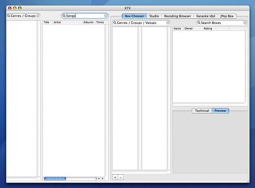
This is a single window version of what KTV might be.
Why not have the Song chooser as some kinf of central screen, and then the other screens whoosh off to the right, left top and bottom for the other sections. This could be wasting already strained cycles.
Here are some preliminary and VERY CRUDE layouts. Well actually the layout is all wrong, but it provides a foundation of what is achievable.
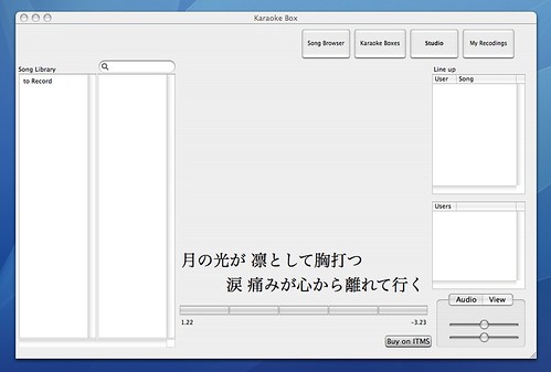
Shows how the main online karaoke view may look. The left hand side shows the song library browser, common to most views, that can wrap all the way into the left.
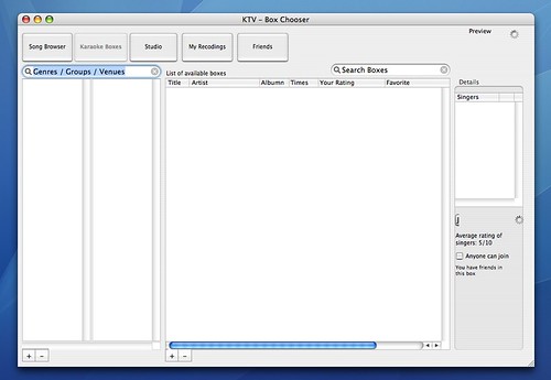
This is kind of what the box chooser would look like. You choose a 'venue' from the left, and then an actual box on the right. From here users can also 'create a new box' and edit its attributes, and then join it. Although the button is hidden, it reads 'join this box'.
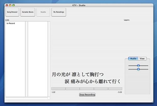
Showing where a user is recording to disk (as opposed to live online broadcast) a karaoke song.
Have to examine whether need to have more than one view on screen at any time.
Sovereign Posture:
Will be designed for mostly full screen use - but could be resized to a small extent.
http://www.wormseyefilms.com/quicktimes/kb_sybg.mov
This is an example of the ghastly effects that that this software could have!
0 Responses to “KTV User Interface”
Leave a Reply